10 Best Practices for YouTube Thumbnail Design
Sarah Johnson
Author
Introduction
Your YouTube thumbnail is the first thing viewers see when browsing videos. It's your video's billboard, book cover, and first impression all rolled into one small image. In a sea of content competing for attention, a well-designed thumbnail can be the difference between a viewer clicking on your video or scrolling past it.
Studies show that 90% of the best-performing videos on YouTube have custom thumbnails. This isn't a coincidence—thumbnails directly impact your click-through rate (CTR), which affects your video's performance in YouTube's algorithm. A higher CTR means more views, better rankings, and increased channel growth.
In this comprehensive guide, we'll explore the 10 best practices for creating eye-catching, effective YouTube thumbnails that drive clicks and grow your channel.
Why YouTube Thumbnails Matter
1. First Impressions Count
Viewers make split-second decisions about whether to watch your video based primarily on the thumbnail. You have less than 2 seconds to capture their attention.
2. Impact on Click-Through Rate (CTR)
A compelling thumbnail can increase your CTR by 2-10x compared to auto-generated thumbnails, directly impacting your video's success.
3. Algorithm Performance
YouTube's algorithm favors videos with high CTR. Better thumbnails lead to more clicks, which signals to YouTube that your content is valuable, resulting in more recommendations.
4. Brand Recognition
Consistent, professional thumbnails help viewers recognize your content instantly, building brand identity and loyalty.
5. Competitive Advantage
In a crowded niche, superior thumbnails help your videos stand out from competitors and attract more viewers.
Best Practice #1: Use High-Resolution Images (1280 x 720 pixels)
Technical Requirements
- Recommended size: 1280 x 720 pixels (16:9 aspect ratio)
- Minimum width: 640 pixels
- File formats: JPG, GIF, or PNG
- Maximum file size: 2MB
- Aspect ratio: 16:9 (standard for YouTube)
Why Resolution Matters
High-resolution thumbnails ensure your image looks crisp and professional across all devices—from smartphones to 4K TVs. Blurry or pixelated thumbnails appear unprofessional and reduce trust.
Implementation Tips
- Always design at 1280 x 720 pixels, even if you plan to compress later
- Use high-quality source images (avoid upscaling low-res images)
- Export at 100% quality for JPG or use PNG for graphics with text
- Test how your thumbnail looks at different sizes (mobile, desktop, TV)
Best Practice #2: Create Visual Contrast and Use Bold Colors
The Psychology of Color
Bright, contrasting colors grab attention in a crowded feed. YouTube's interface uses white, black, and red, so thumbnails with complementary colors stand out more.
Effective Color Combinations
High-Contrast Pairs:
- Yellow and black (high visibility)
- Orange and blue (complementary contrast)
- Red and white (bold and clean)
- Green and purple (vibrant contrast)
- Cyan and orange (modern and eye-catching)
Colors to Avoid:
- All-gray or muted tones (blend into background)
- Too many competing colors (visual chaos)
- Colors too similar to YouTube's interface (red, white, black only)
Implementation Tips
- Use 2-3 main colors maximum
- Ensure text contrasts strongly with background
- Test thumbnails in grayscale to verify contrast levels
- Consider color psychology (red = urgency, blue = trust, yellow = optimism)
Best Practice #3: Include Clear, Readable Text (But Not Too Much)
The Text Sweet Spot
Text on thumbnails should be concise, impactful, and easy to read at small sizes. Aim for 3-5 words maximum.
Text Best Practices
Font Selection:
- Use bold, thick fonts (Impact, Bebas Neue, Montserrat Bold)
- Avoid thin, script, or decorative fonts
- Ensure readability at thumbnail size (156 x 88 pixels on mobile)
Font Size:
- Minimum 30-40pt for main text
- Larger is better (60-100pt for key words)
- Test readability on mobile devices
Text Effects:
- Add stroke/outline (3-5px) for contrast
- Use drop shadows for depth
- Consider background boxes for better readability
- Avoid excessive effects that reduce clarity
What to Write
- Key benefit or value proposition
- Intriguing question or statement
- Number or statistic (e.g., "10 Tips," "$1000")
- Emotional trigger words (Amazing, Shocking, Secret)
What to Avoid
- Repeating your entire video title
- More than 6-7 words
- Small or hard-to-read fonts
- Text that blends into the background
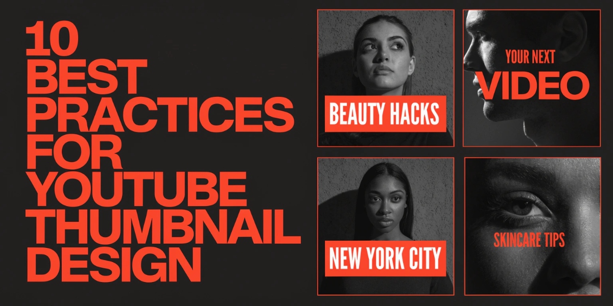
Best Practice #4: Feature Faces with Expressive Emotions
The Power of Human Connection
Thumbnails with human faces receive 38% more clicks than those without. Faces create emotional connection and trust with viewers.
Facial Expression Guidelines
Effective Expressions:
- Surprise: Wide eyes, open mouth (creates curiosity)
- Excitement: Big smile, energetic pose (conveys enthusiasm)
- Shock: Exaggerated reaction (triggers curiosity)
- Contemplation: Thoughtful look (for educational content)
- Confidence: Direct eye contact, slight smile (builds trust)
Expressions to Avoid:
- Neutral or bored expressions
- Looking away from camera
- Overly serious or angry (unless intentional for niche)
- Blurry or poorly lit faces
Face Positioning
- Position face on left or right third (rule of thirds)
- Ensure face is large enough to see clearly (at least 1/4 of thumbnail)
- Use direct eye contact with camera
- Leave space for text on opposite side
Lighting and Quality
- Use good lighting (natural or ring light)
- Ensure face is in focus and sharp
- Avoid shadows on face
- Consider using a solid or blurred background
Best Practice #5: Maintain Consistent Branding
Why Consistency Matters
Consistent thumbnails help viewers instantly recognize your content, building brand loyalty and increasing the likelihood they'll click on your videos.
Elements of Consistent Branding
Color Palette:
- Choose 2-3 brand colors and use them consistently
- Create color variations for different video series
- Maintain color consistency across all thumbnails
Typography:
- Use the same 1-2 fonts across all thumbnails
- Maintain consistent text placement
- Keep font sizes proportional
Layout Template:
- Create a template with consistent element placement
- Use the same background style or pattern
- Position logo or watermark in the same spot
Logo/Watermark:
- Include small logo in corner (bottom right is common)
- Keep it subtle (5-10% of thumbnail size)
- Ensure it doesn't obstruct important elements
Series Differentiation
While maintaining overall brand consistency, create subtle variations for different video series:
- Different background colors for different series
- Unique icons or graphics for each series
- Consistent numbering or labeling system
Best Practice #6: Follow the Rule of Thirds
What is the Rule of Thirds?
The rule of thirds divides your thumbnail into a 3x3 grid. Placing important elements along these lines or at their intersections creates more visually appealing, balanced compositions.
How to Apply It
Horizontal Divisions:
- Top third: Text, logos, or secondary elements
- Middle third: Main subject (face, product, key visual)
- Bottom third: Supporting text or graphics
Vertical Divisions:
- Left third: Face or main subject
- Middle third: Transition or negative space
- Right third: Text or supporting elements
Practical Examples
- Place face on left third, text on right third
- Position main subject at intersection points
- Use middle third for background or context
- Avoid centering everything (creates static composition)
Best Practice #7: Create Curiosity Without Clickbait
The Fine Line
Effective thumbnails create curiosity and intrigue without being misleading. Clickbait may get initial clicks but damages trust and watch time.
Curiosity-Generating Techniques
Ask Questions:
- "Can You Solve This?"
- "What Happens Next?"
- "Why Does This Work?"
Show Before/After:
- Split-screen comparisons
- Transformation previews
- Progress indicators
Use Numbers:
- "10 Secrets"
- "$1000 Challenge"
- "3 Mistakes"
Tease the Outcome:
- Show partial results
- Hint at surprising revelations
- Preview key moments
Avoid Clickbait
- Don't show content not in the video
- Avoid misleading text or images
- Don't exaggerate or lie about content
- Ensure thumbnail accurately represents video
Best Practice #8: Optimize for Mobile Viewing
Mobile-First Design
Over 70% of YouTube watch time comes from mobile devices. Your thumbnail must look great at small sizes.
Mobile Optimization Checklist
Size Testing:
- View thumbnail at 156 x 88 pixels (mobile size)
- Ensure text is still readable
- Verify faces are recognizable
- Check that key elements are visible
Simplification:
- Use fewer elements (3-4 maximum)
- Increase text size
- Simplify graphics and icons
- Remove unnecessary details
Contrast Enhancement:
- Increase color contrast for small screens
- Use bolder outlines on text
- Ensure background doesn't compete with foreground
Testing Process
- Design thumbnail at full size (1280 x 720)
- Resize to mobile size (156 x 88)
- Check readability and clarity
- Adjust elements if needed
- Test on actual mobile device
Best Practice #9: Use Professional Design Tools
Recommended Design Tools
Canva (Beginner-Friendly)
- Pros: Easy to use, templates available, free version
- Cons: Limited customization, watermark on free version
- Best for: Beginners, quick designs
Adobe Photoshop (Professional)
- Pros: Maximum control, professional features, industry standard
- Cons: Steep learning curve, subscription cost
- Best for: Advanced users, professional creators
Figma (Collaborative)
- Pros: Free, browser-based, collaborative features
- Cons: Requires internet connection
- Best for: Teams, designers familiar with web tools
GIMP (Free Alternative)
- Pros: Free, open-source, powerful features
- Cons: Less intuitive interface
- Best for: Budget-conscious creators
Snappa (Quick and Easy)
- Pros: Simple interface, YouTube thumbnail templates
- Cons: Limited free version
- Best for: Fast thumbnail creation
Essential Design Elements
- High-quality stock photos (Unsplash, Pexels)
- Custom fonts (Google Fonts, DaFont)
- Icons and graphics (Flaticon, Noun Project)
- Background removal tools (Remove.bg)
Best Practice #10: A/B Test Your Thumbnails
Why Testing Matters
What you think looks good may not resonate with your audience. A/B testing helps you discover what actually drives clicks.
How to A/B Test Thumbnails
Method 1: YouTube Studio (Limited)
- Upload video with one thumbnail
- Monitor CTR for 24-48 hours
- Change thumbnail to alternative version
- Compare CTR performance
Method 2: TubeBuddy (Automated)
- Install TubeBuddy browser extension
- Upload multiple thumbnail variations
- TubeBuddy automatically rotates and tests
- View performance analytics
Method 3: Manual Tracking
- Create 2-3 thumbnail variations
- Test on different videos in same niche
- Track CTR in YouTube Analytics
- Identify winning patterns
What to Test
- Different facial expressions
- Text vs. no text
- Color schemes
- Image composition
- Font styles and sizes
- Background styles
Analyzing Results
- Focus on CTR (click-through rate)
- Consider watch time (high CTR but low watch time = clickbait)
- Look for patterns across multiple tests
- Implement winning elements in future thumbnails
Common Thumbnail Mistakes to Avoid
Mistake 1: Using Auto-Generated Thumbnails
YouTube's auto-generated thumbnails are random frames from your video and rarely represent your content well. Always use custom thumbnails.
Mistake 2: Too Much Text
Cramming too much text makes thumbnails cluttered and unreadable. Stick to 3-5 words maximum.
Mistake 3: Low Contrast
Text and images that blend together are invisible at small sizes. Always ensure high contrast.
Mistake 4: Inconsistent Branding
Random, unrelated thumbnail styles confuse viewers and hurt brand recognition.
Mistake 5: Misleading Content
Clickbait thumbnails may get initial clicks but damage trust and hurt long-term channel growth.
Mistake 6: Ignoring Mobile
Designing only for desktop means your thumbnails look terrible on mobile, where most viewers watch.
Mistake 7: Poor Image Quality
Blurry, pixelated, or low-resolution images look unprofessional and reduce credibility.
Tools and Resources
TubeGrabr's Thumbnail Downloader
Need inspiration? Use TubeGrabr's YouTube Thumbnail Downloader to analyze successful thumbnails in your niche. Download thumbnails from top-performing videos to study what works.
Additional Resources
- Color Palette Generators: Coolors.co, Adobe Color
- Font Pairing: FontPair, Google Fonts
- Stock Photos: Unsplash, Pexels, Pixabay
- Icons: Flaticon, Noun Project, Font Awesome
- Analytics: YouTube Studio, TubeBuddy, VidIQ
Conclusion
Creating effective YouTube thumbnails is both an art and a science. By following these 10 best practices—using high-resolution images, creating visual contrast, including readable text, featuring expressive faces, maintaining consistent branding, following the rule of thirds, creating curiosity, optimizing for mobile, using professional tools, and A/B testing—you can significantly improve your click-through rates and channel growth.
Remember that thumbnail design is an ongoing process. What works today may not work tomorrow as trends and audience preferences evolve. Continuously test, analyze, and refine your approach based on data and feedback.
Start implementing these best practices today, and watch your video views and channel growth soar!
Need thumbnail inspiration? Use TubeGrabr's Thumbnail Downloader to analyze successful thumbnails and create your own eye-catching designs!